
Jesus Christ Superstar
Portage High School
Portage, WI
April, 2007
Costumes by Donna Schmit
Directed by Mike Powers
Orchestra Directed by Tom Shaver

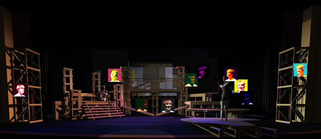
CAD rendering using Vectorworks (11.5)

Curtain speech by director Mike Powers helped introduce the prodcution to our small town crowd.

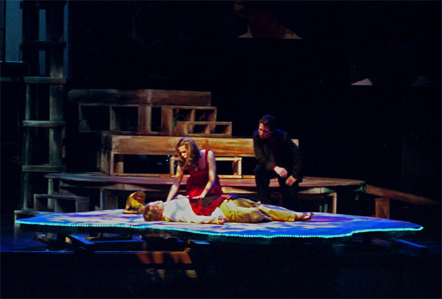
End of "I Don't Know how to Love Him"

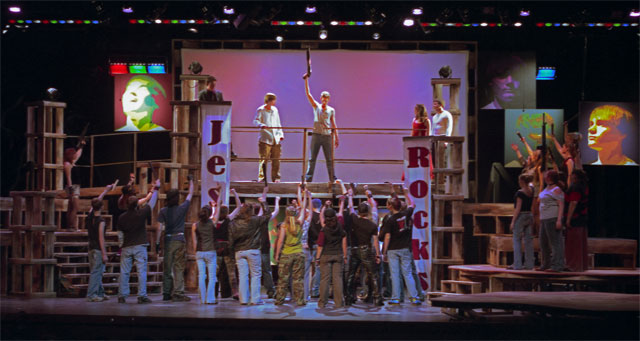
"This Jesus Must Die"

"Simon Zealot"

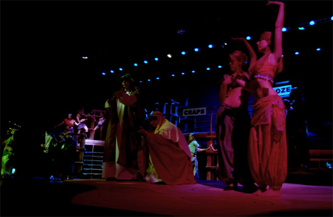
"The Temple"
Production
Notes:
As my first scenic design at the Portage High School, which has a stage that obviously commands a good amount of real estate, I had to balance my desires to really go all out on this design and my insecurities about designing something that could not realistically be built with the personnel and resources at hand. The result seemed to serve the show well without completely breaking the backs of the crews. Another consideration was that for several years the school has relied on rented drops for their shows. While I love a good drop as much as the next lighting designer, I felt I needed to depart from that tradition. While I did imploy a rear projection screen for some video and light texturing, I don't think the drops were missed for this show. The other primary goal was that the show never stop. Run without intermission, the show came in at a lean hour and forty minutes. The final consideration was the feeling of the show. We wanted a modern, but not overtly removed feel. We wanted to capture the rock and roll concert feeling of the show without being overtly tied to that image. We wanted a historically rooted, yet "post-modern" look to the show. Ultimately, for me, the driving beat was this - how would Jesus's minsitry looked if filmed on a camera phone, uploaded to YouTube and turned into a concert? For better or worse, I think we captured this view fairly well.
The primary scenic approach started with the understanding that this show allows us into the story of Jesus from an untraditional view - that of Judas. His view is, of course, skewed by his frustrations with the manner in which Jesus and the other disciples are proceeding. Judas's view is also, obviously, not the Biblical view or opinion of who Jesus was and is, and for better or worse, allows us to see "underneath" the Biblical story. With this in mind, I designed a set that also allowed us to "see underneath." In this way, the visual was one of a set laid bare. A lot of platforming with designed support structures. (As a side note, my Christian self didn't want to insinuate that the Biblical story was a "fascade" of some kind that we were peeling away and replacing with the "real structure," but my artist self wanted to be true to the artistic material. Ultimately, I found while exploring this score, if you keep in mind the heart of the character "speaking," there is little that really conflicts with the Biblical account of Jesus's life.) Another design conceit was that of the "Jesus platform" on stage left being irregularly shaped and as you moved across the stage, you went across a circular platfrom, then angular platforms until reaching the far stage right, the temple area, that was very rigid and linear and surrounded by columns. The idea being that Jesus was non-traditional and came from a grounded location while the temple area (which served both the Priests and the Romans) was a very structured location. Since the play is also so much about the various views of Jesus (from a threat to a lover to a friend to a God), we created various images of our Jesus in a Pop-Art style showing his various moods, from laughter to stern gaze.
The lighting for this show ended up falling into four areas. Jesus was dominated by blues and white-blues. A clean, cool look that evoked a calm (even amidst turmoil). Judas was dominated by reds and textures, for as much the passion with which he pursued his plans as the obvious sinister undertones. The Priests took on a sickly green tone, betraying their sickly intentions of self preservation. The Romans were strong white, occasionally into the audiences eyes (though this is something I rarely do, it was used to selected effect here), and evoked the power of the Roman world. The base lighting was enhanced with various effects throughout the show to help create the various locations. Rope light on several platforms (see above as well as rope lights on the steps and a mirror ball during "King Herod's Song"), two towers (see top pic) downstage of the proscenium as well as intentionally low trimmed electrics gave the entire show a somewhat rock and roll feel circa the mid '70's. (Would that we could afford movers to bring that into the modern/postmodern era.) This feel was augmented with occasional bits of video shot for the show, which ultimately created a unique combination of concert footage and "YouTube documentary." The mix played well, especially to our high school audience.
